Maine is the oldest state in the country, so the questions other states will face about aging with dignity, purpose, and choice are being asked here first. For more than 50 years, Southern Maine Agency on Aging has been answering them for its neighbors.
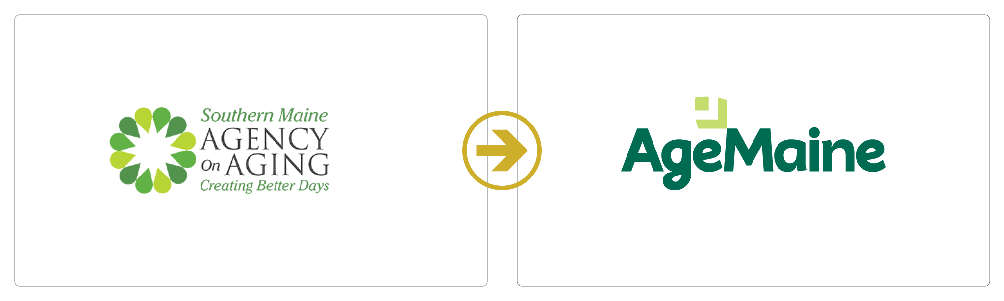
By 2026, the organization’s name no longer matched its work. Its leaders chose a new one, AgeMaine, and asked Warp + Weft to build the verbal and visual brand around it. AgeMaine launched on Oct. 5, 2026, in front of nearly 200 guests.
A Name the Work Had Outgrown
The old name sounded like a government office with a regional boundary. Direct services were still rooted in York and Cumberland counties, but the organization’s influence reached across Maine. More than 500 volunteers worked alongside roughly 70 staff. The agency built models that other organizations adopted, and it brought the experiences of older adults into the rooms where funding and policy are decided.
AgeMaine reflected that wider role. The brand needed to present the organization as a statewide leader while staying familiar to the people who had relied on it for years.
The Visit, Not the Meal
We started with what was already working: the strong language the organization’s team had been using for years. We refined it, unified it, and aligned it with the new name.
The stories we heard from staff and the people they serve kept returning to one idea. People valued the meal, the help with Medicare, and the hours of respite, but what they talked about was the person who came to the door. One line from the positioning sums it up: the visit was always more important than the meal.
The positioning statement describes aging as a stretch of life to be lived fully and gives AgeMaine a statewide purpose: “If aging is going to be figured out anywhere, let’s start here.” We also defined the benefits people get from AgeMaine and what sets it apart, including a three-word promise: “We don’t let go.”
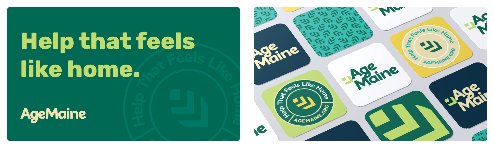
The tagline came from the people AgeMaine serves: Help that feels like home. “Help” names what AgeMaine offers. “Feels like home” describes how it arrives.
A Look to Match
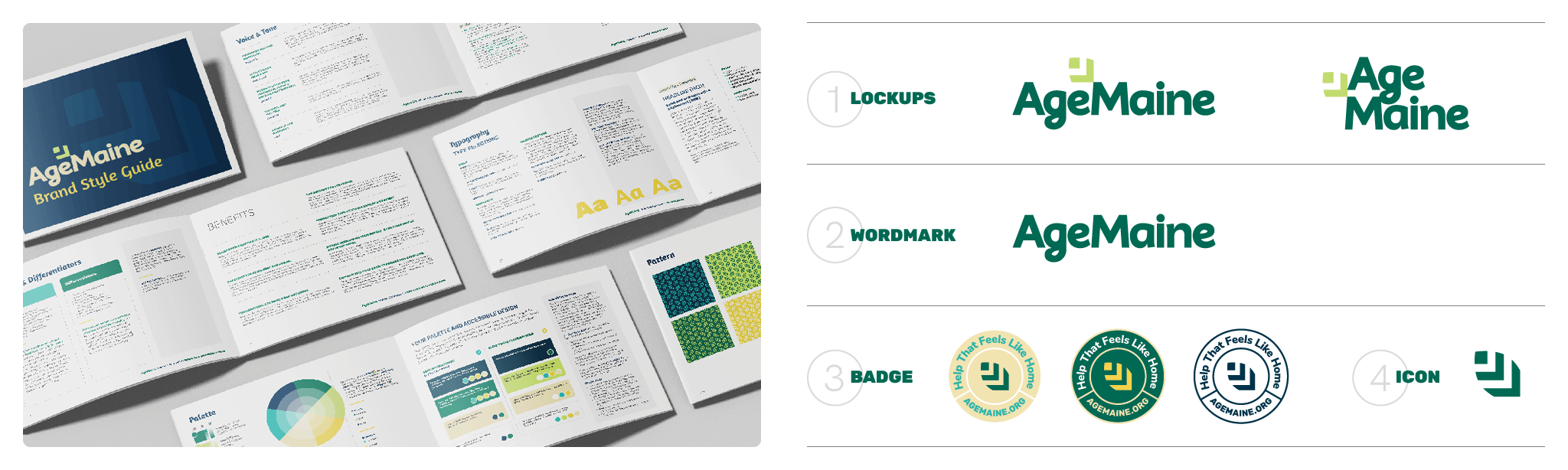
The old name came with a lot of history, and the new one needed a visual identity that felt just as trustworthy without looking institutional. The icon is a leaf, built from simple angled shapes. It points to new growth, for an organization stepping into a statewide role and for the people it serves, who are still growing, learning, and making plans of their own. The icon sits beside a rounded, friendly wordmark and repeats across a pattern, so even a single mark on a van or a name badge reads as AgeMaine.
The colors come from the same idea. Deep green and navy give the brand a steady, grounded base, and brighter lime, teal, and yellow keep it from feeling serious or clinical. The result looks at home on a policy report and on a Meals on Wheels delivery.
The Launch
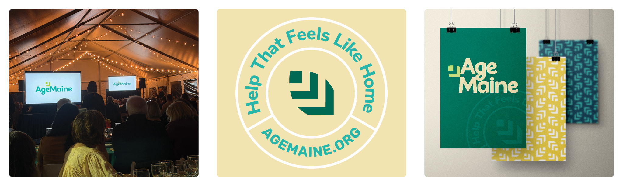
AgeMaine revealed its new name and identity in October, in front of nearly 200 guests at its Portland Center. When the new brand appeared on screen as they read the new positioning aloud, the room broke into applause. For an organization asking a community to embrace a new name after more than 50 years, that response mattered. Longtime supporters, volunteers, and partners saw an organization they already knew, presented with fresh energy.
AgeMaine’s promise to the community helped make the change feel easy: “Same people. Same programs. Same commitment.”
The Result
AgeMaine now has a brand built on what the organization already did well. Staff and volunteers have shared language to describe their work, and the people who rely on AgeMaine can see that the organization they trust is still here. Partners and policymakers see an organization ready to lead on aging in Maine.