Tucked into the mountains of western Maine, Summit Achievement has spent decades doing something quietly remarkable: helping adolescents and their families find their footing through a model that blends personalized clinical care, accredited academics, and adventure therapy. And by every account, it works. What wasn’t working was the brand around it.
In 2025, Summit brought Warp + Weft in for a full, end-to-end engagement: brand strategy, a new visual and verbal identity, a brand style guide, a completely rebuilt website, and video content to bring it all to life. The brief was simple to say and hard to earn: build a brand as sophisticated as the program it represents.
Why a Rebrand?
Summit had a rare problem. The program was deeper and more clinically sophisticated than most people realized, and the brand let that depth go unnoticed. To a family in crisis scanning options online, Summit could read as just another wilderness program, or get lumped in with the boot camps it has nothing in common with. It is neither.
We started the way we always do, by listening. An on-site immersion with leadership, surveys of staff and the referring professionals who send families Summit’s way, and a hard look at the competitive field brought the gaps into focus fast. Some referring professionals assumed Summit worked with less complex cases than it actually does. The program’s clinical rigor was its best-kept secret. And the website, by the team’s own honest assessment, did the program a disservice.
There was also a differentiator hiding in plain sight. Summit doesn’t transport students against their will. Enrollment is voluntary, and that choice, that first yes, is foundational to how healing happens there. For parents weighing an impossible decision, it turns out to be one of the most reassuring things Summit can say.

“We were impressed with their creativity, their ability to immediately grasp our complex business and put it into simpler terms, and their responsiveness and professionalism. Warp and Weft is simply awesome.”– Nichol Ernst, CEO, Summit Achievement
Building the Brand
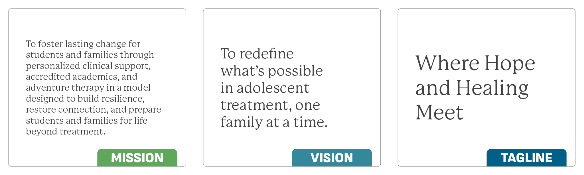
With the strategy set, we built the verbal and visual identity around what makes Summit genuinely different: an integrative model it pioneered long before “hybrid” became a marketing word, and a culture built on consent rather than coercion. The messaging stayed grounded, warm, and clinically credible all at once, because the people reading it, referring professionals and anxious parents alike, can spot a sales pitch from a mile off.
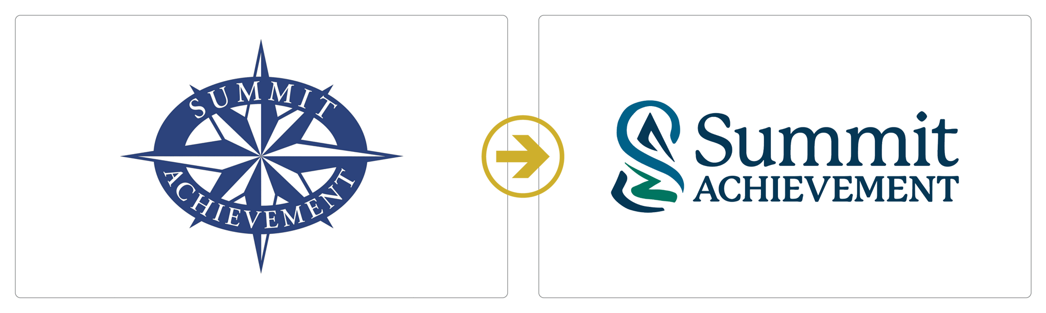
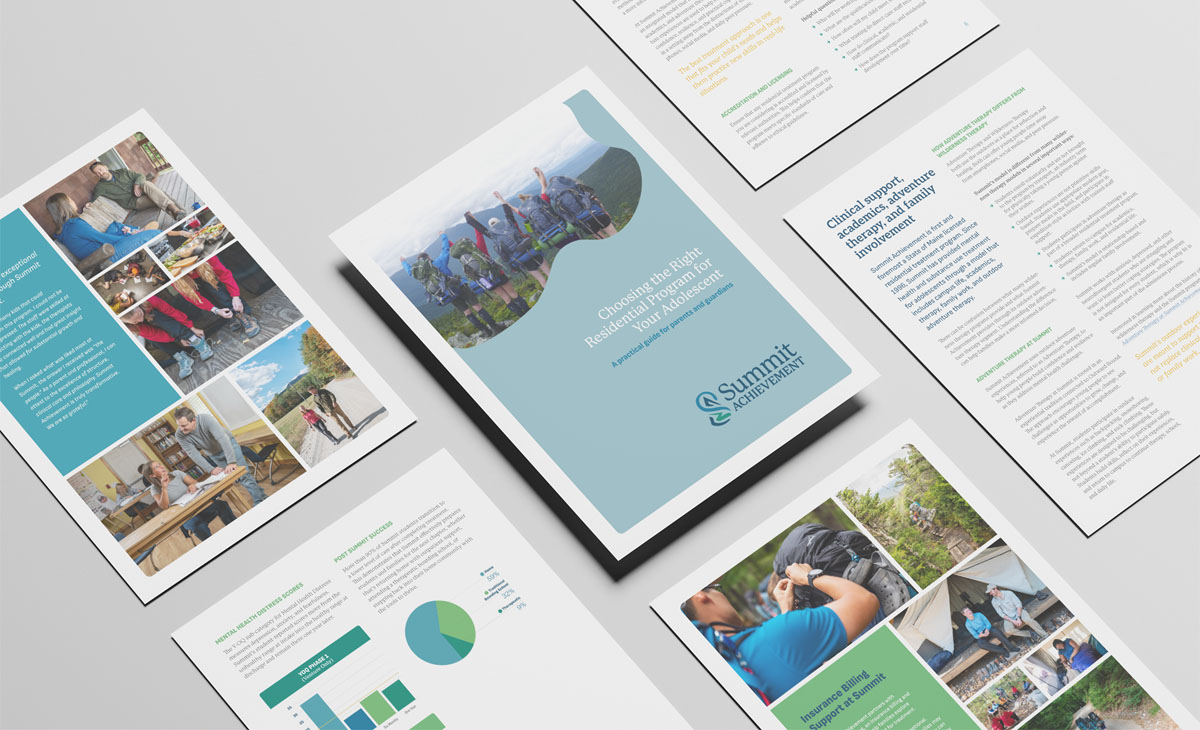
The visual system followed: a refreshed logo, a considered color palette, typography, and a full brand style guide so every future touchpoint stays consistent, whether Summit is building a tradeshow display or a one-page handout for a school counselor.
A Website Worthy of the Program
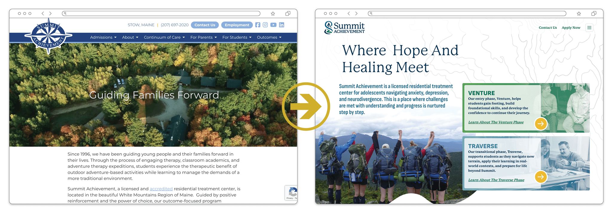
The website carried the most weight. For most families, it’s the first real look at Summit, and the old one didn’t reflect the depth waiting behind it. We designed and developed a new site built to do the actual work of the brand: explain a complex model in plain terms, answer the why behind it, and let families picture the place.
Then we went further and produced video content, a tour of the campus and the spirit of Summit told through the voices of the people who work there. For a program families research long before they ever visit, seeing it, and hearing from real staff, changes everything.
The Result
The brand is new, and the story is still being written. But the trail is clearer now. For the first time, Summit Achievement has a brand that reads as clearly as its program works, from the website to the video to every touchpoint a family meets on the way to saying yes. Every family’s hardest walk starts at the edge of the woods. Summit’s brand now meets them there, and shows them the way through.