We’re going into a little detail here, stick with me.
There are a lot of typography terms—ligature, baseline, ascender, etc… I won’t bore you with a definition of each, but x-height is one you should know and understand because it can have a big impact on the legibility of small text.
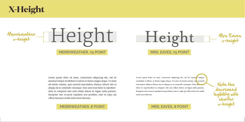
What is X-Height?
The x-height is the height of a lowercase letter not including the ascenders or descenders.
Font measurements (point size) isn’t impacted by x-height so, you can have two fonts that are both sized at 12 points with significantly different x-heights. The larger the x-height, the more legible the fonts is—especially at a smaller size.
Designing captions or needing to fit a lot of content into a small space? Stick with a font that has a larger x-height.
Is your brand as strong as it can be? Are you putting a clear and consistent message into the marketplace? Could you be doing better? There’s only one way to find out: a brand audit.