Kerning So Bad I Can’t Even
Typography isn’t just putting words on paper, it’s making those words legible.
The right choices in type can communicate a message more directly or imbue a word with emotional content beyond its denotated meaning. Typeface selection, weight, and size can all work together to elevate a message, or they can fail miserably and completely upend it.
One of the most extreme ways a word’s meaning can be distorted is with bad kerning.

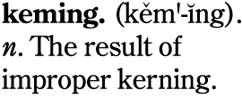
Credit: David Friedman of http://www.ironicsans.com
Kerning is the space between two characters (characters in this case are letters, numbers, and punctuation marks–basically anything on your keyboard). Kern too loosely, and the word becomes disjointed. Kern too tightly, and your “c” and “i” end up reading as a “d” which can lead to some really NSFW examples of bad kerning (google “kerning Fails” and you will get the picture quickly).
Ok, that one is safe for work and you’ll be surprised at who will laugh at a “nerdy design joke,” but this is serious. Bad kerning might not kill, but it does really get under the skin of anyone tuned into it.
Here are some of my “Kerning So Bad I Can’t Even” examples:
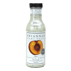
Kerning So Bad I Can’t Even Eat:
Did they mean for “Bria” and “Nnas” to read as two separate words?

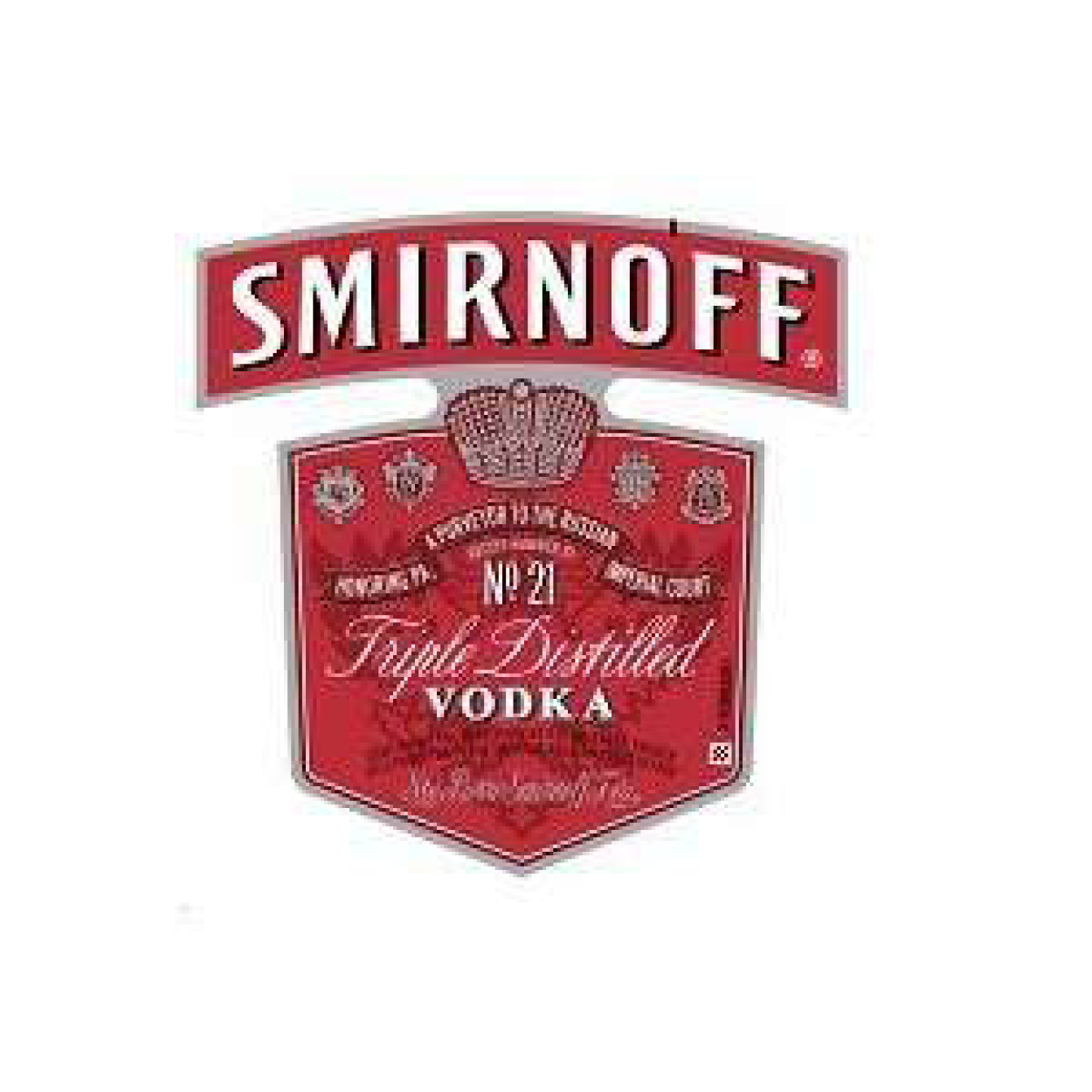
Kerning So Bad I Can’t Even Drink:
Could the “A” be any further away from the “K”? Yes, the shape of the letters makes them difficult to kern, but this would make me order a gin martini.

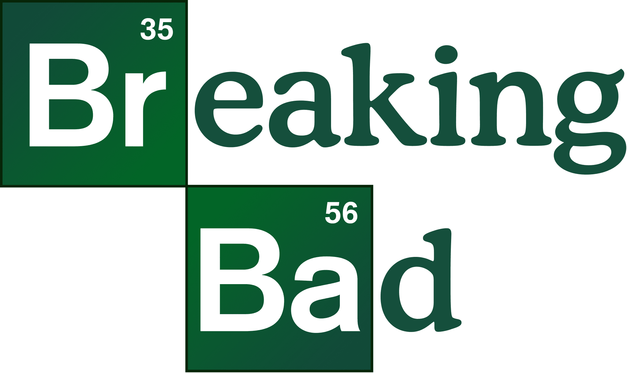
Kerning So Bad I Can’t Even Watch:
I get it. It’s clever, but awkward. A little more attention to the kerning would have gone a long way to even this spacing out.

Kerning So Bad I Can’t Even Shop:
Has anyone else noticed that they bothered to draw a ligature connecting the “W” and “H”, ran the “OO” into each other, but then left the poor “E” hanging off of the end? Also the closest store is 1.5 hours from my house, so that makes it hard to shop there, too.

While bad kerning might not single-handedly drive consumer trends, it is subconsciously noticeable even by those who can’t name it. And when a brand’s visual presentation just feels “off,” what is the salad dressing going to taste like?


