 In healthcare, your expertise, credentials, and reputation are hard-earned assets. But while clinical skill forms the backbone of a successful practice, a strong brand is what amplifies that success. A strategically developed brand can transform a healthcare practice into a thriving business by attracting the right patients, retaining top talent, and creating long-term growth and profitability.
Let’s explore how healthcare branding, when done right, delivers measurable business outcomes.
Differentiate Your Practice and Command Market Share
In today’s competitive healthcare landscape, differentiation is key. A well-crafted brand creates a unique identity for your practice, setting it apart from competitors.
Your brand tells prospective patients why they should choose your services over others, highlighting your values, expertise, and the exceptional care you provide.
Business Outcome:
By standing out in the market, your practice becomes the go-to provider for your specialty, increasing patient volume and loyalty.
A recognizable, professional brand builds trust and positions your practice as a leader in your community, giving you a competitive edge.
Strengthen Employee Retention and Recruitment
A strong employer brand isn’t just about patient perception—it’s critical for attracting and retaining skilled healthcare professionals.
Your brand communicates your practice’s values, workplace culture, and dedication to excellence, making it easier to attract right-fit talent.
Business Outcome:
Lower recruitment costs and turnover rates, saving your practice time and resources.
A cohesive, mission-driven team aligned with your brand fosters a positive workplace culture and enhances the patient experience.
Increase Patient Trust and Willingness to Pay for Quality Care
Patients don’t just choose healthcare providers based on proximity—they choose providers they trust.
A well-designed brand inspires confidence by signaling reliability, professionalism, and commitment to patient care.
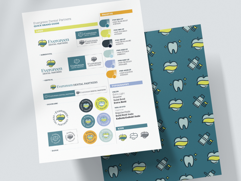
Logo: Your logo, as the visual cornerstone of your brand, symbolizes trust and stability. Consistent use across all platforms reinforces your reputation.
Color Palette: Strategic use of color evokes emotion and builds connections with patients, fostering loyalty.
Typography: Clean, professional fonts enhance communication, making your messaging clear and accessible.
Business Outcome:
Patients are more likely to choose your practice and recommend it to others, increasing referrals and revenue.
Higher perceived value enables you to command premium rates for services, boosting profitability.
Improve Operational Efficiency with Clear Messaging
Branding isn’t just about visuals; it’s also about clarity. A strong verbal identity—your tone, messaging, and language—ensures your patients and staff understand your mission and services.
Business Outcome:
Answering common patient questions on your website saves staff time, allowing them to focus on care delivery.
Strategic branding aligns internal and external communication, creating a seamless patient journey from first contact to follow-up care.
Increase the Value of Your Practice
For healthcare practitioners with long-term goals of growth, expansion, or even selling their practice, a strong brand increases marketability.
Buyers view practices with professional branding, streamlined processes, and clear market positioning as valuable, turnkey investments.
Business Outcome:
A reputable, growth-ready brand increases the sale price or attractiveness of your practice to potential partners or buyers.
Strategic branding future-proofs your practice, ensuring it remains adaptable and competitive in a changing healthcare landscape.
A Practical Investment in Growth
A successful brand isn’t just a collection of design elements—it’s a powerful business asset that drives measurable outcomes.
By investing in strategic branding, your healthcare practice can:
Expand its patient base while retaining right-fit clients.
Attract and keep talented staff who share your vision.
Build trust and increase patient lifetime value.
Streamline operations and enhance efficiency.
Position itself for long-term growth and profitability.
Beyond aesthetics, a strong brand delivers tangible results. When thoughtfully developed and consistently maintained, it becomes the foundation for a thriving healthcare practice, unlocking opportunities and driving sustainable growth.


