 Andwell Health Partners, formerly known as Androscoggin Home Healthcare and Hospice, is the largest, independent, non-profit home and community-based healthcare organization in Maine. In 2024 they unveiled a rebrand that included a new name and updated visual identity.
Warp + Weft has been Andwell’s branding and marketing partner for the past decade, and we were honored to work alongside them through the rebranding process.
Why Rebrand?
Androscoggin Home Healthcare and Hospice has always been a beloved organization with substantial brand equity. They have served patients in and around Androscoggin County. Maine for decades. So, why rebrand? There were a few reasons:
Originally known for their hospice care, the organization now offers a full continuum of services. The reference to “hospice” in their name was a turn-off to patients who weren’t receiving end-of-life care.
The name Androscoggin gave the perception that they only served patients in Androscoggin County when, in fact, they serve the entire state of Maine.
Patients, partners, and referral sources outside Androscoggin County always had trouble spelling and pronouncing the word Androscoggin, which meant the organization had to own multiple website addresses with every misspelling possible to ensure they could be found online.
So, the renaming process began.
“As we continue to grow and evolve, we realized that the name Androscoggin Home Healthcare and Hospice no longer accurately reflected who we are, where we are going, and who we serve.” – Deb Fournier, Board Chair
What’s in a Name?
Not every rebrand includes a new name but, when it does, the process is longer and more challenging. Undergoing an organizational name change is complex and expensive – something we don’t take lightly. In the case of Androscoggin, however, there was consensus among the board and leadership that it was not only a necessary step but also a welcome one.
Our team conducted an exhaustive search for a new name. As we frequently tell clients, naming is part visionary and part practical, and the process must take all of the following into consideration:
For trademarking and differentiating purposes, the name should not already be in use within the organization’s industry – in this case, health care.
It should be a name for which we can obtain a federal trademark.
We want to find a name with meaning and relevance to the organization, a name that leadership and staff can stand behind.
The name should be easy to spell and pronounce.
The name should have an available domain (URL) that’s short and easy to remember.
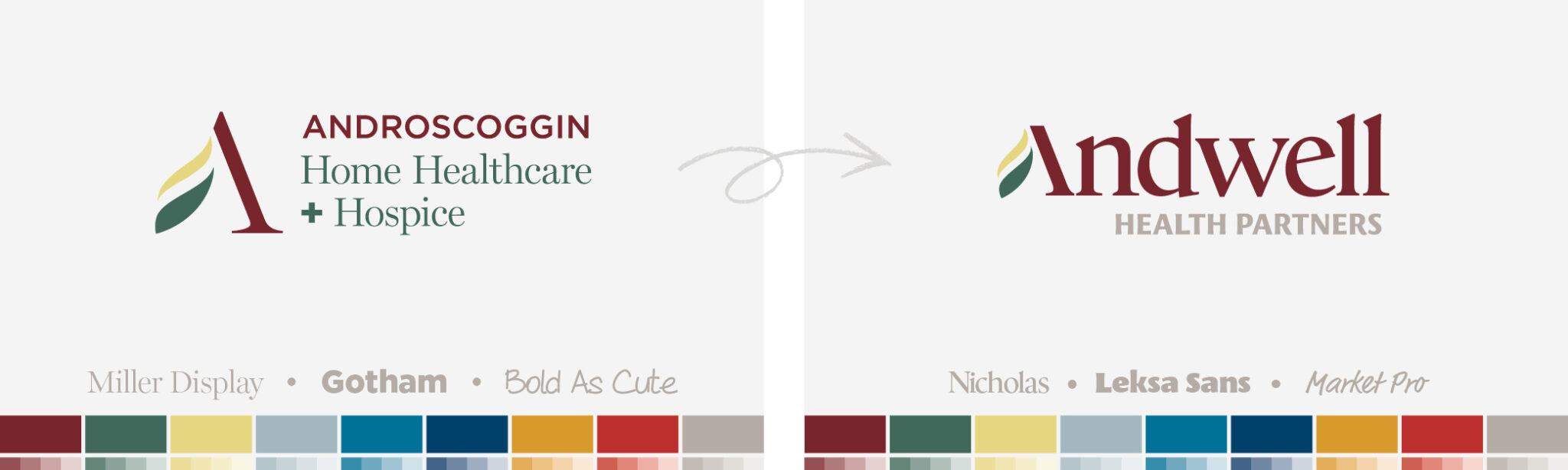
In the case of Androscoggin, whose brand equity was already strong, their visual identity (logo, color palette, visual style) was well known and identifiable in the community; we didn’t want to get rid of it completely and risk the loss of that equity or create confusion in the local market. The “A” in Androscoggin had been used as a visual identifier for years. Coming up with a new name that started with the same letter would allow us to continue using that recognizable element of the brand.
So, we made the naming process harder for ourselves and included another requirement:
The name must start with an “A”!
The entire process was complex and not without hiccups, but, in the end, we landed on a name that had buy-in from the leadership team and the Board of Directors and met all of our requirements – Andwell Health Partners.
Refreshing the Identity
Now that we had a name, it was time to refresh the visual and verbal identity. The existing brand identity had many elements that still spoke to the vision and values of the organization. Maintaining that consistency would help ease the transition from Androscoggin to Andwell because the general public would know and recognize the organization within the new brand. The color palette, primary tagline, a majority of the messaging, and of course, the “A” iconography all remained the same.
Maintaining elements of the original brand also helped us get in front of one of the major perceptions or misperceptions a rebrand can incite: acquisition. Maintaining a certain amount of brand continuity helped the organization to communicate that it had not been acquired by another healthcare company.
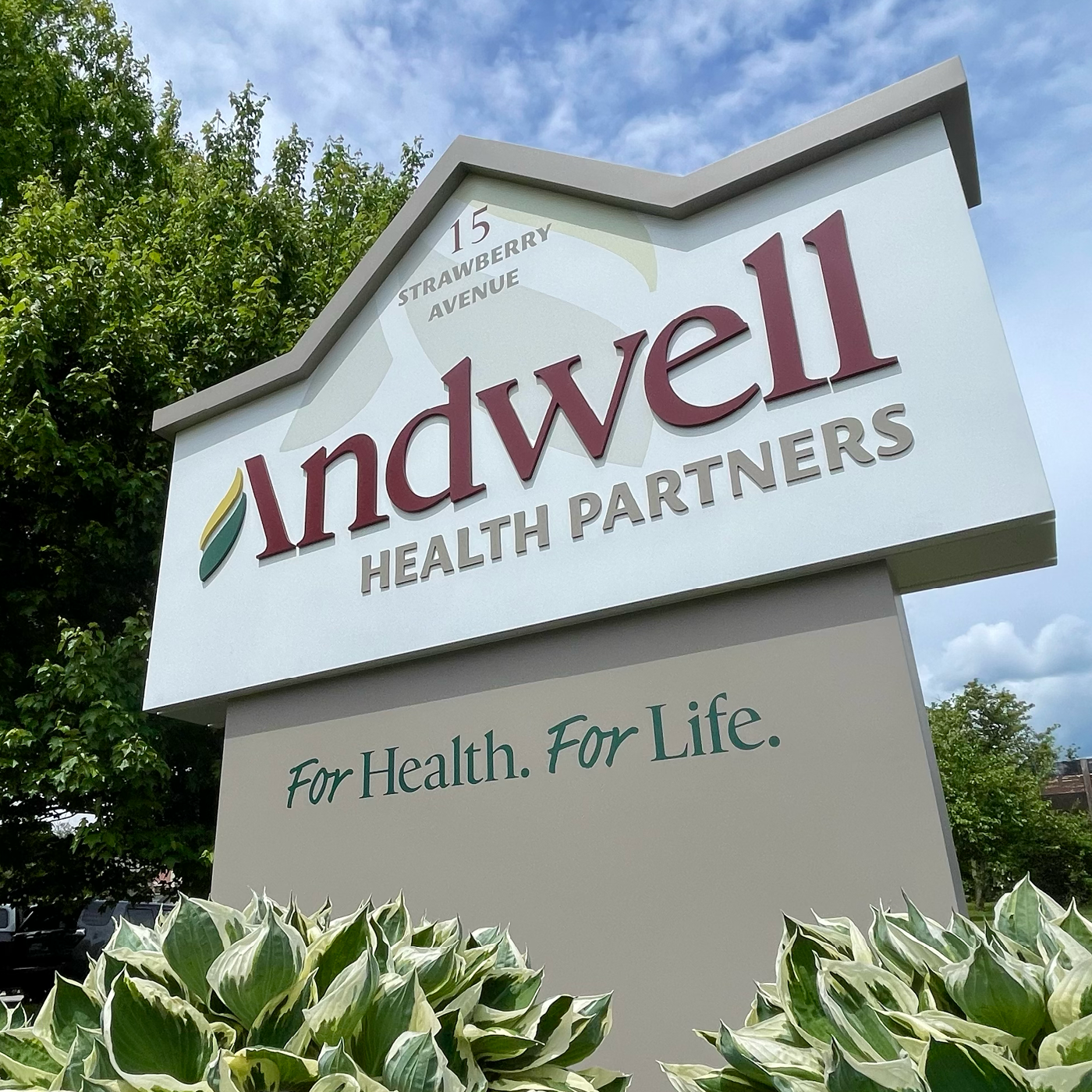
The new logo introduced a more modern typeface and visual iconography that reflected their growth and vision for the future.
With the visual and verbal identity in place, it was time for the public launch.
New Name. Same Heart.
Undertaking a thoughtful and intentional brand launch is as crucial to the process as the brand itself. Over a period of months, we crafted and executed a launch plan that included both internal and external initiatives.
Internally, a series of town-hall style meetings were conducted to explain the changes, answer questions, and encourage staff and providers to become advocates for the new brand.
Externally, we were preparing personalized letters to constituents, conducting photo and video shoots, revamping the website, redesigning signage, and preparing advertising and marketing initiatives to announce the change.
In June of 2024, the new brand was released with a statewide campaign called New Name. Same Heart.
The Result
The Andwell Health Partners rebrand was met with accolades from local patients, donors, and community leaders as well as kudos from national peers and affiliate organizations. They celebrated with a ribbon cutting and speeches from leadership that recognized the organization’s deep history, their recent accomplishments, and their vision for the future of health care.
“We are proud of our important place on the healthcare continuum, and we know that Andwell Health Partners reflects our true evolution and vision. Our name may have changed, but our heart hasn’t. We are still the same great people, and we are still committed to enhancing quality of life by providing innovative and compassionate health care for all.”– Ken Albert, Andwell’s President and CEO
Since launching the new brand just five months ago, Andwell has acquired a Lewiston, Maine-based agency that provides pediatric therapy and early learning services as well as pediatric and adult audiology. They have expanded their hospice services to northern Maine, launched a new mobile wound care program, and opened an outpatient therapy center in Lewiston.
The re-envisioned brand has provided a catalyst for growth, and we can’t wait to see where they go from here!